• Welcome to the new NAXJA Forum! If your password does not work, please use "Forgot your password?" link on the log-in page. Please feel free to reach out to [email protected] if we can provide any assistance.

SoCalFest T-Shirt Design Contest

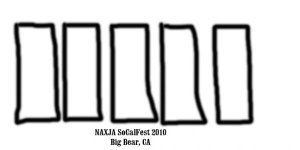
Alright, here's another idea'r...

I've left a bit of open space on the left there, so you can see that the color of the tree's and mtn's are the color of the shirt...the white would be the color of the screen-printy-ness...

Picture2-1.jpg

I imagine this to be the back panel, with a low-key black border
with a small,

"naxja,
socalfest,
2010"

...on the front pocket.


Btw, the photo should look familiar, but I actually just drew
it out, simplifying and interpreting as I went, so its actually a bit different...
 
Last edited:
This does not seem to be goin anywhere,lets just let Rich and Kim come up with something and go with it, they have always done a great job in the past,my two cents......SANTA

Don't go volunteering other people's services Kenny. :) Rich has said that he'd rather not do the shirts this year. And that's understandable.
 
No, the problem (from what I hear, at least) is that when you use a photograph, it's (a) very difficult, and (b) very expensive, to get it to turn out well on a t-shirt cost-effectively & durably. Too many colors & variables, or some such gobbledegook.

You need to design with the thought in mind screen printing is backwards. A good design on paper can sometimes not look even close once printed.
 
Change the grill, add SoCal Fest 2010 NAXJA Big Bear
or whatever

JeepLogo.jpg
 
Same idea, change the grill so it looks like an XJ.....

JeepLogo.1.gif
 
i liked overlands design.. very elegant and i believe it would look good on any color shirt
 
I say somewhere on the shirt it says "I went to SoCalFest 2010, and all I got was this friggin T-shirt!"
 
i liked overlands design.. very elegant and i believe it would look good on any color shirt

elegant or not, photo reproduction printing like that is A.) not cheap on a small run of shirts, and B.) going to crack apart and look hideous after awhile.
 
Alright, here's another idea'r...

I've left a bit of open space on the left there, so you can see that the color of the tree's and mtn's are the color of the shirt...the white would be the color of the screen-printy-ness...

Picture2-1.jpg

I imagine this to be the back panel, with a low-key black border
with a small,

"naxja,
socalfest,
2010"

...on the front pocket.


Btw, the photo should look familiar, but I actually just drew
it out, simplifying and interpreting as I went, so its actually a bit different...

elegant or not, photo reproduction printing like that is A.) not cheap on a small run of shirts, and B.) going to crack apart and look hideous after awhile.


The one above, which I think is the one they're talking about...is not a photo reprodution. Its one color, stylized, and very screen printable...

Thanks for the comments all...

When are we going to vote on a design?
 
Whats the point of voting if most of us know nothing of screenprinting/ grapics design?
Seems like we need someone who knows whats up in charge.
 
The one above, which I think is the one they're talking about...is not a photo reprodution. Its one color, stylized, and very screen printable..

i stand corrected. on that one, 2 things you need to avoid are very fine lines and large areas of solid color. applying a halftone screen to make a gradation of that large white area would help some.

Josh, when is the cutoff for this? PM me i have a bit of time tomorrow.
 
i stand corrected. on that one, 2 things you need to avoid are very fine lines and large areas of solid color. applying a halftone screen to make a gradation of that large white area would help some.

Josh, when is the cutoff for this? PM me i have a bit of time tomorrow.

Excellent...thanks for the input!

I'm not going to submit something else, but for others who might, in the next day or two, its good for them to know what will work and what won't.

Love to get some feedback from those running this, if they've already got a design or not. Whatever it ends up being will likely be cool, in any case.

:cheers:
 
I wear the hell out of my socalfest 08 shirt. my favorite part about it is it incorporates our chapter logo as part of the design. I am not sure who originally drew up the logo, but I really like the cartoony big tired XJ with one wheel up on a rock :dunno: maybe switch it up a bit and have it crawlin up the logo, some snowcapped trees and a mountain or two in the background. just throwing out ideas.


I just started back from spring break, and I'm going to have one HELL of a round of classes this time. I do however have a couple hours today. I'll try to draw something up.... it may be too late to get the shirts printed in time though.

Customink.com will print your designs quick and ship em to you, last time i had some done it took a week from order to my door. don't know how long the printer we are using takes. :dunno:
 
Last edited:
Back
Top