• Welcome to the new NAXJA Forum! If your password does not work, please use "Forgot your password?" link on the log-in page. Please feel free to reach out to [email protected] if we can provide any assistance.

Finally a LOGO!

Team Willys

www.rocksolidfab.com
Location
Chattanooga, TN
So... I have kinda been thinking that I needed a name for myself since I am really starting to build things for people. I have had the name in my head for a while, just never had time to sit down and do something with it.

So after a couple hours of playing in AutoCAD and Paint Shop, heres what I came up with:
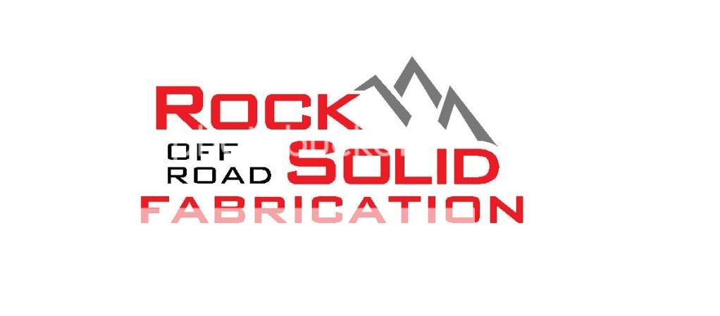
RockSolidLogo.jpg


I also designed some 1" x 3" tags that just say "Rock Solid" in that font (only side by side instead of the partial over under) that will be laser cut from 11 GA. These will be available so that I can place them on the things I do such as a torque arm, narrowed axle, suspension system, crossmember, etc... Kinda just a little signature touch. I got the tag Idea at the Trcukfest; Currie Enterprises has tags they they weld onto the parts before they are released.

What do you guys think?
 
Did I get one?
 
Really cool idea.... but my bumper is by a company called Roxolid fabrications. I don't know if the similarity matters at all but I thought I would let you know.
 
OK, lets ee what you got. I have absolutley no programs other than AutoCAD 2004 to do anything with. I liked the boxy/rough lines but Im open for ideas. I haven't given it to the shop to have the lasercut yet.

Blake, see what you can do. I kinda want that layout, with the location of the words and mountains, but you can change the fonts and stuff. I also like how I have the letters run together in "Rock Solid", if you look, you can see that they are notched out to clear one another.
 
Well... I actually like that a lot! Looks good man! I like both of them! I could get decals of both, bottom for dark backgrounds, top for light backgrounds.

Could you draw something in AutoCAD that I could use for a name plate? The bottom part might look good, but how about one that just said "Rock Solid"? That way I can compare the 2 and see which one I like better.

Thanks man!
 
i like both designs myself...

not sure what's in the works for blake doing just "rock solid"... i like the mountains coming off the K, so maybe having the rock on top of solid, with the mountains to the side would be cool...

black and red always look good... maybe try silver instead of white? :dunno:
 
yeah i like both too, maybe try the overlap like the original, and i agree the mountains off the K look awesome, but i wouldnt move them, just drop the OR and fab part
 
I don't like the fat letters lol. Im going for the lean mean and strong look, not the Im fat, slow, and overly big look lol. And the bottom one doesn't do it for me either... I don't really care for that font too much. Lets see the first one with silver instead of white, Blake (the one with the black background). A charcoal color for the mountains on the one with the white background might look cool too. That should be really easy for you to change.
 
I like that first one a lot! The second one would look better with "Off Road" staying white, and the mountains charcoal too.

So basically the only difference between the two would be the "Off Road", one being white, and one being black.

I think I'll go with that.

Can you email me the AutoCAD files? I need them back-saved to 2004. I'll send you a PM with the info.
 
those last two look really good...

the silver was a nice touch :)
 
Back
Top